Branding
IDnow DocIDV offers extensive customization options to tailor the product to your specific needs and brand identity. From visual theming and typography to illustrations and content, you have full control over the look and feel of the verification experience.
To apply any color or text customization, please contact your dedicated IDnow representative. They will ensure the changes are correctly configured for your integration.
Playground
We are providing a playground to test different customizations.
Theme
Colors
The color system in IDnow DocIDV is built on color primitives rather than component-specific colors. This means that when you customize a color, it will automatically apply to all UI elements that use that color primitive - including buttons, links, animations, and other interface elements. You cannot change the color of individual components in isolation; instead, you modify the underlying color primitives that multiple components reference.
The color palette is organized into two main categories:
- Brand colors: The primary colors that define your brand identity and are used for interactive elements, states, and key UI components
- Grey scale: A neutral color range used for text, backgrounds, borders, and other structural elements
All color values must be provided in HSL format (Hue, Saturation, Lightness) without the "hsl" prefix. For example, use 14, 79%, 55% instead of hsl(14, 79%, 55%).
The default color values have been carefully selected to meet WCAG accessibility standards, ensuring sufficient contrast ratios and readability for all users. When customizing colors, we recommend maintaining similar contrast levels to preserve accessibility.
Brand colors
These are the main colors used throughout the application.
| Configuration Key | Default Value (H, S, L) | Default Value Preview |
|---|---|---|
| theme.color.brand.primary | 14, 79%, 55% | |
| theme.color.brand.primary_variant | 17, 100%, 96% | |
| theme.color.brand.secondary | 236, 34%, 17% | |
| theme.color.brand.secondary_variant | 221, 43%, 35% | |
| theme.color.brand.error | 0, 65%, 57% | |
| theme.color.brand.processing | 39, 92%, 61% | |
| theme.color.brand.success | 179, 40%, 50% | |
| theme.color.brand.active | 209, 100%, 64% |
Grey scale
This is the grey scale used in the application, from lighter to darker colors. It is mainly used for fonts, backgrounds and borders.
| Configuration Key | Default Value (H, S, L) | Default Value Preview |
|---|---|---|
| theme.color.grey.100 | 0, 0%, 100% | |
| theme.color.grey.200 | 0, 0%, 93% | |
| theme.color.grey.300 | 0, 0%, 87% | |
| theme.color.grey.400 | 0, 0%, 71% | |
| theme.color.grey.500 | 0, 0%, 53% | |
| theme.color.grey.600 | 0, 0%, 35% | |
| theme.color.grey.800 | 0, 0%, 20% | |
| theme.color.grey.900 | 245, 25%, 10% |
Roundness
The roundness system controls the border radius applied to UI elements like buttons, cards, and containers throughout the application. This allows you to create anything from sharp, angular designs (0px) to fully rounded, pill-shaped elements (400px).
Four radius levels are available to maintain visual consistency.
Each value should be specified as a length in pixels.
For a completely square aesthetic, set all radius values to 0px.
| Configuration Key | Default Value | Description | Default Value Preview |
|---|---|---|---|
| theme.radius.1 | 4px | Subtle rounding for small elements | |
| theme.radius.2 | 8px | Standard rounding for most UI components | |
| theme.radius.3 | 16px | Pronounced rounding for emphasis | |
| theme.radius.4 | 400px | Complete rounding for pill-shaped buttons and elements |
Fonts
Font Family
The font family system allows you to customize the typeface used throughout the application. You can specify different fonts for headings and body content to create visual hierarchy and match your brand typography.
By default, IDnowSans is used for both headings and content text, providing a clean and modern appearance optimized for digital interfaces.
| Configuration Key | Default Value |
|---|---|
| theme.font.family.heading | { name: "IDnowSans", format: "woff2" } |
| theme.font.family.content | { name: "IDnowSans", format: "woff2" } |
When specifying a custom font, provide the font name exactly as it appears in your font files (case-sensitive).
The following font-family will be generated: <Font Name>, Helvetica, Arial, Verdana, sans-serif.
If your custom font fails to load (due to network issues, incorrect file paths, or unsupported formats), the browser will automatically fall back to the next available font in the sequence. This ensures text remains readable even if the primary font is unavailable.
The font is used with two different font weights:
- regular (400)
- medium (500)
You will have to provide the two corresponding font files.
Expected file format is WOFF or WOFF2 (Web Open Font Format). Usage of TTF and OTF files is not recommended for the web (files are significantly larger and it usually contravenes license agreements. More information here).
Files should be named <Font Name>-Regular.woff2 and <Font Name>-Medium.woff2.
Ex: PlayfairDisplay-Regular.woff2, PermanentMarker-Medium.woff
Font Size
Results may vary, misuse of these configuration keys may break application layout
The font size system controls the typography scale used throughout the application. Font sizes are defined in rem units (relative to the root font size), ensuring consistent scaling across different devices and user preferences.
| Configuration Key | Default Value | Description | Default Value Preview |
|---|---|---|---|
| theme.font.size.00 | 0.875rem | Small text elements (captions, labels, fine print) | Lorem Ipsum |
| theme.font.size.0 | 1rem | Body text (standard content) | Lorem Ipsum |
| theme.font.size.1 | 1.125rem | H6 headings | Lorem Ipsum |
| theme.font.size.2 | 1.266rem | H5 headings | Lorem Ipsum |
| theme.font.size.3 | 1.424rem | H4 headings | Lorem Ipsum |
| theme.font.size.4 | 1.602rem | H3 headings | Lorem Ipsum |
| theme.font.size.5 | 1.802rem | H2 headings | Lorem Ipsum |
| theme.font.size.6 | 2.027rem | H1 headings (largest) | Lorem Ipsum |
Density / Spacing
Results may vary, misuse of these configuration keys may break application layout
The spacing system controls the layout density and distance between UI elements throughout the application. This allows you to create compact, information-dense interfaces or more spacious, comfortable layouts.
These spacing values affect:
- Padding within components
- Margins between elements
- Gap spacing in layouts
- Overall interface density
Spacing values are defined in pixels and follow a consistent scale based on multiples of 8, ensuring visual rhythm and alignment across all components.
| Configuration Key | Default Value | Default Value Preview |
|---|---|---|
| theme.spacing.0_5 | 4px | | | |
| theme.spacing.1 | 8px | | | |
| theme.spacing.2 | 16px | | | |
| theme.spacing.3 | 24px | | | |
| theme.spacing.4 | 32px | | | |
| theme.spacing.5 | 40px | | | |
| theme.spacing.6 | 48px | | | |
Logo
The logo consists in an image that is displayed in the header of the application.
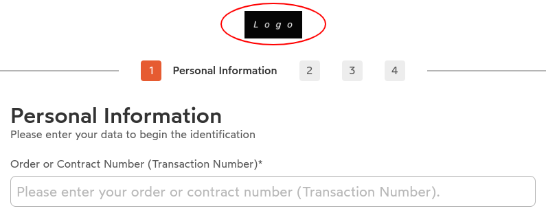
Logo customization requires a PNG image file.
The logo height is fixed at 56px with the aspect ratio preserved automatically (horizontal orientation recommended).
Color Scheme
IDnow DocIDV supports both light and dark themes. The theme dynamically adjusts based on the user's system preferences.
When using the dark theme, the colors will automatically be adapted to ensure optimal visibility and contrast based on the brand colors and grey scale colors.
If you do not want to support both themes, it is possible to enforce a specific theme (light or dark).
Illustrations / Animations
Illustrations and animations are used throughout the application to enhance the user experience and provide visual feedback. These visual elements help guide users through the document verification process and make the interface more engaging and intuitive.
They colors dynamically adapt to follow the brand theme and the color scheme.
They can be customized to match your brand identity and provide a more personalized experience. To customize an animation, you need to provide a Lottie JSON file. Other animation formats (such as GIF, MP4, or SVG) are not supported.
For the best visual experience, custom animations and illustrations should maintain a similar aspect ratio to the original assets. Significantly different aspect ratios may result in unexpected scaling or layout issues.
Wordings
All text content in the application can be customized to match your brand voice and language preferences.
Customization Options
You can customize various types of text content throughout the verification flow:
- Instructions and guidance: Modify step-by-step instructions to match your tone of voice
- Button labels: Customize action buttons and navigation elements
- Error messages: Personalize error and validation messages
- Success messages: Tailor confirmation and completion messages
- Helper text: Adjust tooltips, hints, and supplementary information
Localization
The SDK supports multiple languages and locales. You can provide translations for all text content to support your users in their preferred language.
Best Practices
When customizing wordings:
- Keep it clear and concise: Users should understand what action to take at each step
- Maintain consistency: Use consistent terminology throughout the flow
- Consider accessibility: Ensure text is descriptive enough for screen readers
- Test thoroughly: Verify that custom text fits within UI components across different screen sizes